

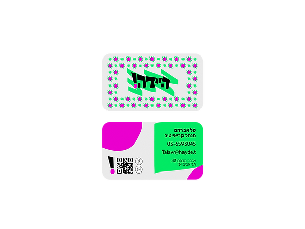
Hayde!
tv channel for youth
Hayde! is a bold and playful youth TV channel brand concept that celebrates creativity, individuality, and raw energy. Designed to break away from traditional, polished formats, it embraces humor, honesty, and local culture, giving a strong, unapologetic voice to a new generation
This project was created as part of my graphic design studies at Studio 6B.


The brand spirit
Name Origin
The name “Hayde!” comes from a popular, energetic Hebrew expression.
It’s a word packed with vibe, spontaneity, and local spirit, instantly familiar to anyone who grew up in Israeli culture.
We chose it because it reflects the brand’s core identity: bold, authentic, young, and full of life.
Vision & Values
-
Creative Freedom. A space to express without filters or limitations.
-
Bold Israeli Spirit. Loud, colorful, and unafraid.
-
Community. Building a shared space where everyone belongs
Moodboard


Design System
coloring
Fresh green
#00ff7a
Represents freshness and vibrancy.
Balances between natural softness and bold, youthful energy.

Sassy Pink
#ff00e1
Radiates energy, joy, and boldness.
Brings a playful, rebellious vibe that breaks conventions and stands out.

Black
#000000
Grounds the bright colors and provides strong visual contrast.
Adds balance and sophistication to the overall palette.
Graphic Elements
Pink Dot

Green Scribble


A punch of attitude and emotion. It’s playful, loud, and draws attention!
A sense of movement, freedom, and spontaneity
Exclamation Mark
A visual punch that captures the energy and urgency of Hayde!

Tipography
Rubik (Hebrew)
אבגדהוזחטיכלמםנןסעפצץקרשת
1234567890!@#$%^,.
Rubik was chosen for its clean, contemporary look combined with a friendly, youthful feel. Its rounded shapes give a sense of warmth and approachability, while maintaining a bold presence and strong visual identity. This balance reflects the brand’s tone. playful yet confident, local yet universal.


This project allowed me to explore the power of bold visual language and authentic local identity. Through color, typography, and playful elements, I created a brand that celebrates youth, creativity, and unapologetic self-expression. Hayde! represents the energy I love bringing into my design work- honest, loud, and full of life.