Israeli Primate Sanctuary


Website Redesign
UX/UI redesign of the Israeli Primate Sanctuary website, turning a real non-profit site into a clear and focused user experience.
This project was created as part of my graphic design studies at Studio 6B
Organization Goals
-
Sell tours (tour = donation)
-
Raise awareness about the sanctuary and its mission


Target Audiences
-
Parents looking for meaningful attractions for their children
-
Institutions seeking fun activities with added value
Competitor Review
A short review of similar attraction websites, Monkey World, Children’s Museum Indiana, and Toronto Zoo, helped define the visual and UX direction.
Key insights
strong, immersive imagery, a single clear CTA, and emotional storytelling combined with concise information

Monkey World

Toronto Zoo

Children's Museum Indiana
MoodBoard
Nature • Warmth • Community • Playfulness


Site Architecture
Old map

scattered, unclear hierarchy, too many subpages
New map

clear donation flow, improved CTA placement, simplified content
Design System
coloring
Leaf Green
#4B924E
White
#FFFFFF
Sky Blue
#B3CBE4
Brown Monkeys
#C19A75
#8C5F32
#995B1E
#998A7B
#DEC7B0
Tipography
Rubik (Hebrew)
אבגדהוזחטיכלמםנןסעפצץקרשת
1234567890!@#$%^,.
Rubik was chosen for its soft, geometric structure and approachable look, which fit the sanctuary’s warm and playful atmosphere.
The font’s clear letterforms make it easy to read for families and children, supporting the site’s educational and friendly tone.
Using a familiar and versatile typeface also helped keep the interface consistent, clean, and accessible.
Sketch

Final Designe


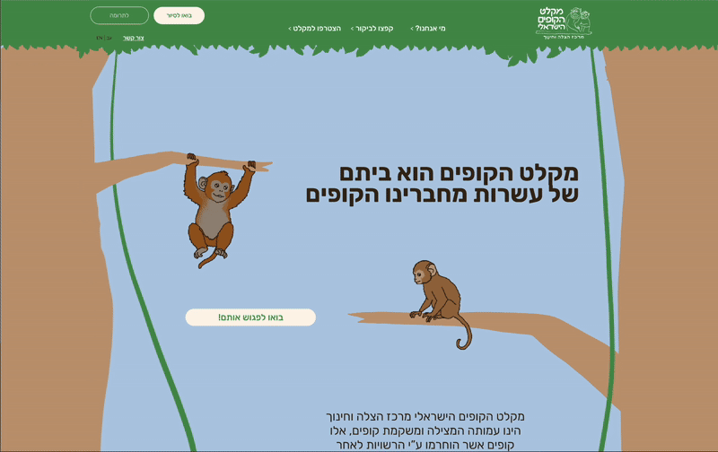
New Homepage
Old Homepage
A quick look at the homepage flow and user interaction in the prototype